Sketch Symbol Override Concept
Sketch 45 has just launched and some great new features for plugins as well as fixed a bunch of frustrating vector editing bugs. One thing that didn’t get any improvements were symbol overrides.
It was important to identify what was causing friction, and explore how it might be improved. There were a few things that this concept set out to achieve:
- Better visual identification of overrides and their relationship
- The ability to override the border-radius and colour of shapes
- The ability to override the alignment, colour, and underlines of text
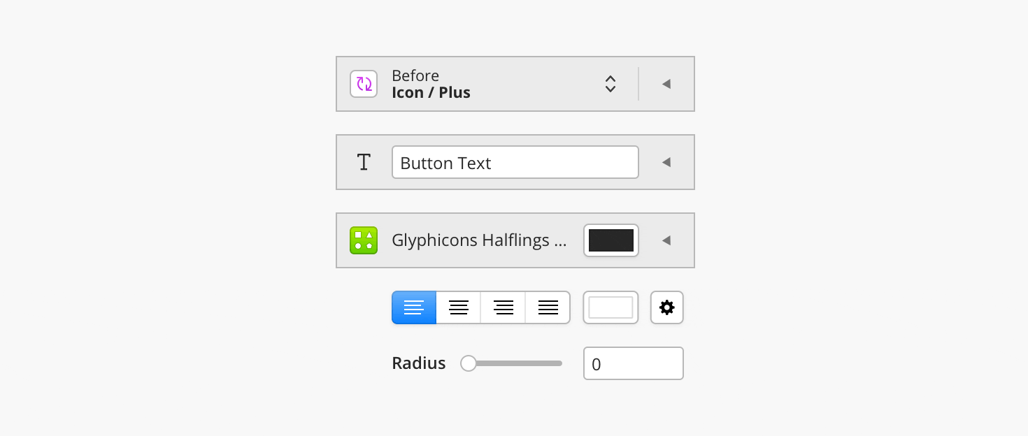
Before
The current symbol override panel flattens the hierarchy so that all symbols exist on the same level and look identical.

This leads to confusion and a non-intuitive search through the labels (which can be truncated) to find the correct ‘top level’ symbol. And then search the symbols that follow those, to identify which nested symbol is needed, and override it.
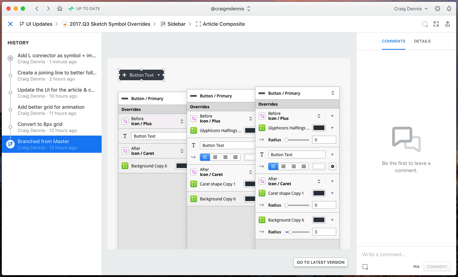
After
Comparing the concept, in its collapsed state, with the existing symbol overrides panel shows that it still uses a similar amount of space.

Using a button with nested symbols as an example, the proposed solution uses an accordion mechanism to re-introduce levels of hierarchy back to the symbols.

- Easier to see the type of override, by using icons to represent them.
- Text is kept editable instead of using a placeholder (easier to identify).
- Direct access to colour overrides without having to create more symbols.
- Clear separation of top-level symbols.
Alignment
The whole design conforms to an 8px grid.
The grid makes alignment easy and the overall look more consistent than the current override panel.
Caveats
This design does not account for deeply nested symbols. The pattern could work with a little modification, so that would be an interesting avenue to explore further.
It could be problematic to show every shape or text layer within a symbol. One idea is to have a checkbox that designates whether a layer can be overridden; potentially extending to allow only specific properties. It’s likely the override will need to be checked by default, so as not to break existing files.
The proposed design is slightly wider than the current sidebar. It can be made narrower to fit but the sub-controls (text alignment for example) would need to be adjusted to survive in the smaller space.
Next Steps
The next thing to try and improve would be the way in which overrides are selected. They’re currently in a simple dropdown, with poor visibility of the content; relying mostly on the name of the layer.
Aside
The project was designed using the Abstract alpha which offers a way to track file changes in a similar way to GIT. The ability to visualise the history of an artboard or symbol is incredibly useful and allows an easy timeline of progress.
Try It Yourself
You can download the Sketch file and play around yourself. It’s an export from Abstract so should contain all commits if you use the app.
If you any thoughts, feel free to reach out on Twitter.